What is style system in AEM?
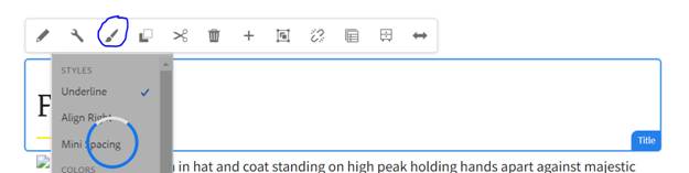
By Style System the template author define custom style classes at the component level, in the content policies of the components Which allows the content author to apply the custom styling based on the selection of the styling while authoring the component on a page. The CSS is being applied from that specific classes. or in simple language. The Style system is basically, by which we can define the classes name, so that the Front End developer can use those classes name to provide the styling like CSS, and Apply the JavaScript based on those classes, on particular component. There will be one brush symbol, which specify that we have style system on component and can apply the styling on it can do it while authoring the component as below screenshot. For instance:
Technically, The Template author can define their own Style classes through the content policy of a component, so the Content author can use those while authoring the components and Custom styling can get apply on that component.
Here we will see how to create the Custom Style System in Adobe Experience Manager. Below are the Steps:
1. Edit the Template and define the style name for that particular component. For this
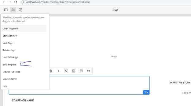
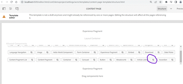
Go to the Page in editor mode. And open the page information and then click on edit template as below:
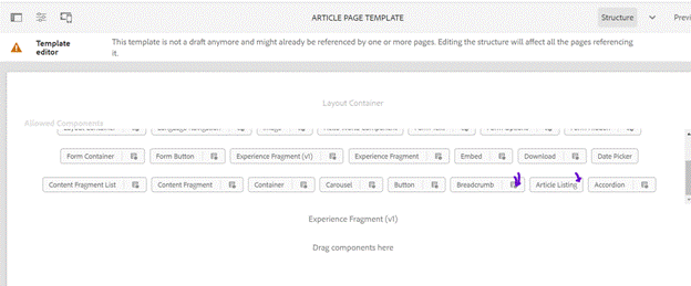
It will open the structure of the template and from there you will find the Allowed components inside the container you will find the various Components name and open the Article Listing components policy as mentioned in the below screenshot.
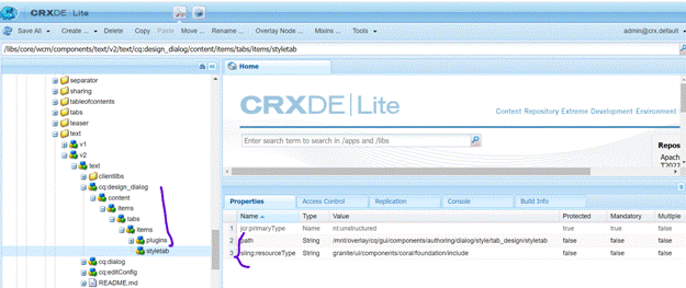
It will open the properties section blinded to the respective templates. As of now we are creating the Styling for “ArticleListing” component, for that First we have to Enable Style Tab in Design Dialogmean we have added the style on the dialog where it allows us to open the style tab on dialog, we need to enable/add it on the dialog. To make it available on dialog Copy the Style Tab from the core component, I have copied the cq:design_dialog node. from the title component and paste it in the article listing component. So, it will allow us to enable the style name on dialog level as well as on the template structure so we can specify our custom class name. Means as you saw in previous screenshot there is no policy icon available inside the “ArticleListing” component but in the breadcrumb it is available so first we have to make is enable then only we can specify our custom style in the specific component and that could be achieved through the cq:design_dialog node, that we have copied from the core component.
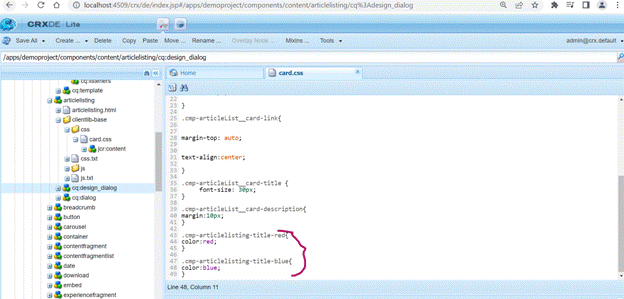
click on the Style and you will find the Allowed style section and just below that existing custom style name. So we are going to add one more color that is Red, so let’s define the label for the style on the dialog then Class name, so for that we will add one more text field by clicking on add button it will add one more text field.
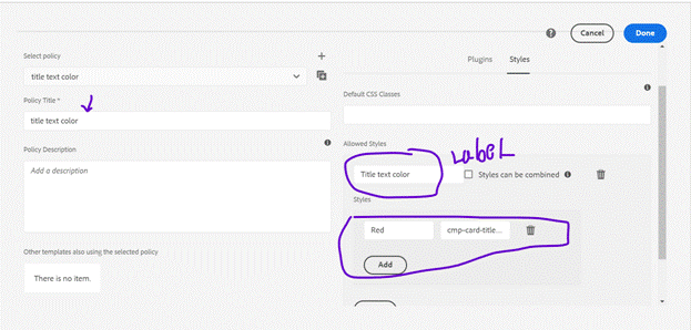
We have added one class name “cmp-articlelisting-title-red” and the label as Red and another “cmp-articlelisting-title-blue” and the label as Blue which will appear on the dialog of the Article Listing component sometime, we have to mention the policy title in the left side. save and exit. Now let’s see the newly added class name in the Crxde.
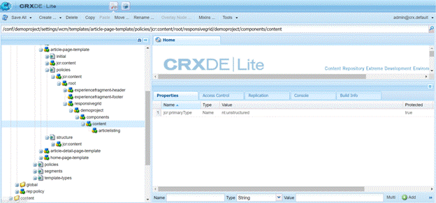
Go to the path:/conf/demoproject/settings/wcm/templates/article-page-template/policies/jcr:content/root/responsivegrid/demoproject/components/content/articlelisting
Where the style system will store later on if we want to push it through the code, we can get it from here and sometimes we need to make the package through package manager and install it manually on the lower and higher environment because AEM does allow to do the template level style changes easily. To solve this, we can install the package manually and can also commit the code as well. Else we can synch up the code in IDE like eclipse or any other that you want.
After coping the cd:design_dialog from core component we can see the policy symbol as below screenshot:
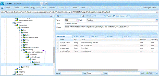
You can also check the authored style classes name on this path: /conf/demoproject/settings/wcm/policies/demoproject/components/content/articlelisting/
Where you will see the policy Id on both the places.
Now lets see the dialog and our recently added styling on the ArticleListing component.
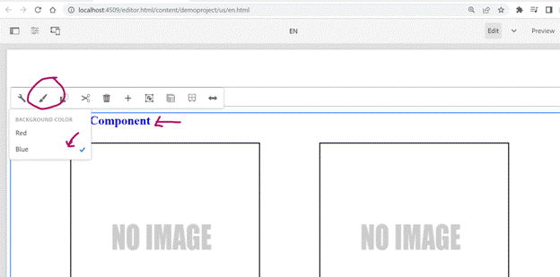
You can see the brush symbol which mean our style is coming and I have selected the Blue color and it changed the Title of the Article Listing component and card heading to Blue as I have used the same selector for both Heading of the component and card title. So for that I have already added the some styling inside the clientlibs of the Article Listing Component. Please refer the below screenshot.
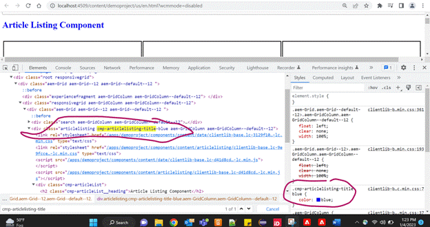
So let’s see in the HTML elements of the page by inspecting the Page, Where you will find the custom classes name.
I will share the code base once the functionality of this Article Listing Component is fully developed.
Happy coding!!!